In what way does your media product use, develop and challenge forms and conventions of real media products?
After hours of filming, cutting, pasting, perfecting and ripping our hair out, our video, poster and digipak is finally finished. We received a boat load of comments telling us how amazing and professional our product looked so it looks like we pulled it off. But how did we do it?
Conventions and forms: There is no way to make this sound professional, so bluntly, we watched and learned.
As we have grown up around channels such as the hits and MTV, we are constantly surrounded with the current products within the music video field. We see them everyday and gradually, even without realising, we have learnt the basic conventions of any music video. So naturally, we would take some influence from this. We also had to analyse current music videos, which taught us any further conventions we needed to achieve the quality we wanted. The main things we realised that we needed were lighting, perfect lip syncing, accurate editing, enhancing camera movement, iconographic mise-en-scene and lots and i mean
LOTS of close ups.
Have we managed to carry this off?
Lighting
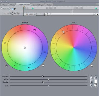
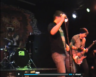
We lit our video using the on-stage lighting. We sharpened the lightening slightly in the editing but not too much as we wanted to keep its raw edge and allow the viewer to feel as though they were there. The stage constisted of many lights, both overhead and down the sides of the stage. This lit up the front of the stage and illuminated our performers. It also caused shadows to fall naturally, and added a dark yet crisp look that could not be artificially created to its extent. This we found to look quite professional as real music performances are lit this way and are sharpened in editing.
The lighting also worked well with our venue and song. The venue was quite dark and looked very giggish with its dark walls and slightly tatty look. This was what we were looking for and we did not want to ruin it with too much lighting. Also, as the song is of a rock genre, in a hgihly lit room, it would look odd so again we thought the lighting we chose was suitable. Overall we found the lighting to fit well with the conventions of the current market as performances of gigs usually are dark and shadowy to add a more rock style effect.
Lip syncing

Okay...so when it comes to lip syncing we may have cheated a little. But if its for a good cause why not?
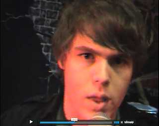
As our song was written by a friend of mine, we were able to get the fellow himself to star in our video. This would be the lovely Jon <<<. As he quite obviously knew the song, he sang for us while we filmed, so we knew our music would fit with his lip movement. However, obviously we did not use the sound from the actual filming as there was talking and a lot of drum noise in the background, and we had to make it fit with the soundtrack. Claps for Alex with his success with this. Down to the T.
Editing
 Our editing was done so much better than I could have ever expected. The amount of cuts is huge and the pace of the editing fits perfectly with the music. As its a fast paced song, the cuts occur every second or so, so the amount of editing that was done took a very long time. A lot of time and a lot of patience. I think we all ended up hating the song.The editing is all done with cuts. The lighting was improved and the song added in. This we wanted to be as professional as possible so we watched music videos over and over. We learnt that the cuts have to be sharp and in appropriate places as opposed to here there and everywhere. We also discovered that the speed of the music determines whether the transition should be cross dissolves or cuts. The focus of the camera had to be relevant to what was on screen, as there is an automatic relation made in the audiences mind and a MASSIVE amount of close ups were needed. We did, however, need to show our band together and in various shots, but close ups of the lead singers face and the various instruments were vital. We developed the idea of quick cuts to add speed, but tried to make them clean and fit well with the music to enable a professional look. This let us add our own edge as well as using the normal conventions of a music video.
Camera Movement

Mmm camera movement...my favourite bit. I must admit while filming I found this very fun. I liked running round with the camera and getting in on the action. But obviously my enjoyment was not the reason why we did it. No, camera movement is essential in a performance. To make out video seem more real and have more energy, we decided that our camera should move opposed to being static. A static camera we felt would lower the intensity of the performance and not show the song's liveliness. I mean C'mon, its called License to Dance.
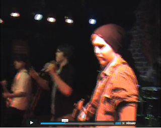
The camera movements that were included in our video fit with the pace of the music. Although it changed speed, beign quicker in places to another, there were no pointless movements involved. We filmed the guitar from one end to the other to emphasise that the guitar was the focus for example, and moved the camera to add a lift to the performance. As our performers were moving, we felt the camera should move too. In the current market, gig performances always have a hand held camera filming them as this adds to the performance. No one wants to sit at home and watch the music as if it were being played by statues. The energy adds atmosphere and we wanted the audience to feel the hype you would at a gig where no one stands still. In gig performances, there are sometimes shots of the crowd, but due to money, time and lack of friends transport, we could not arrange this.
Mise-en-scene

The mise-en-scene is one of the most important parts of the arrangement of the shoot. You can not change it afterwards and it needs to be perfect to present what you want to be presented. We wanted our video to show the rock genre of the song so we hired out a gig venue with lighting and speakers to amplify out song. We needed the right instruments, so asked our performers to bring them to the shoot. We also asked them to dress in dark or dull coloured clothes. This was all except for the lead singer who we thought needed to stand out a little so asked him to add a splash of colour, hence the green shirt. We wanted them to be alike to the band the Kaiser Chiefs, who have similar clothing styles but are completely different. This we feel we managed to acheive as the boys all wore constrasting outfits, but could easily fit well together. We feel this fits well to the industry, as the song isn't hard rock so we didn't want them to look 'grundge', yet it wasn't electronica so we wanted to find some mid ground. We think as there aren't any bands which exactly fit this genre of music that we had found the look that they would have in the industry.
Close ups

Closer. No, Closer...
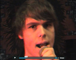
CLOSER!! < familiar words from the filming day. As filming had been done more than once before to a, lets be honest, pretty shoddy standard, this time we wanted to get it just right. We discovered that the closest shots we had from the previous attempts were medium close ups and that in real media productions, you could pratically taste the guitar strings. So armed with our camera, we made our final and much more suitable attempt. After hours of footage, a song we could no longer bear and everyones personal space invaded, we had reels and reels of footage that showed close ups of
EVERYTHING. This we found to be far more useful and indeed usable than all the other footage we had so far. Although various other distance shots were used, close ups were the main. We needed these as we wanted the audience to feel, as we were, close to the band. In the current market, most shots of a band are close ups of the instruments and the lead singer. We felt we achieved the expectations of a professional music video from most points of view, yet mainly the close ups.
MAGAZINE ADVERTISEMENT
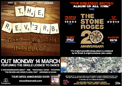
We feel that our magazine advertisement would easily fit into the current market. This is as it adheres to the conventions of the real poster, on the right. Neither show the band, yet represent it with an image or an icon and the name of the artist and the album is clear to see. They both have star ratings and comments from those who would recommend it printed within the advert. Logos have been included on the left bottom corner and other informantion is included. They both have an edgy and different feel to them which we feel to be essential in the professional world.
DIGIPAK

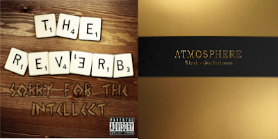
These covers are both very plain. As we had a band and we didn't have to include them on the cover, we wanted to keep it simple. This is why it simply states the band and the album name, just like the real one. We also kept a basic colour scheme as is in the other. Although ours is simple, it is a little more busy than the other, yet we like it as it reflects the energy of the video.
